
Why AI images look AI, and the prompts that fix it
AI images read as fake because they are too perfect. The prompts, reference swaps, and color grade we use to make generated people pass as real.
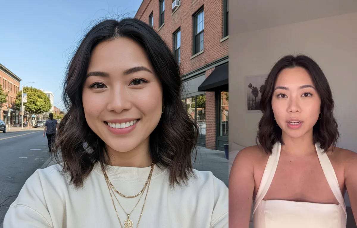
AI images fail for one reason. They're too perfect. Perfect skin, perfect lighting, perfectly blurred background. Nobody's phone takes that photo. So the moment a viewer's thumb slows down, some part of their brain files it under "ad" and keeps scrolling.
We generate thousands of images that pass as real people's photos, and the entire trick is subtraction. Realism comes from noticing each thing that makes an image read as generated and killing it. There are only about seven of them.
Start with the device, not the shot
Our base prompt doesn't ask for a "photorealistic portrait." It asks for a hyper-realistic selfie photo that looks like it was taken with an iPhone by someone else. The difference sounds cosmetic and isn't. "Portrait" reaches for studio conventions. "Taken with an iPhone by someone else" reaches for camera-roll conventions, and the camera roll is where real life lives.
Then you have to ask for skin, and you have to be explicit about it. Realistic skin texture, natural lighting, no filters or heavy airbrushing. Left alone, every image model airbrushes, because airbrushed faces are overrepresented in everything it learned from. Texture doesn't happen unless you demand it.
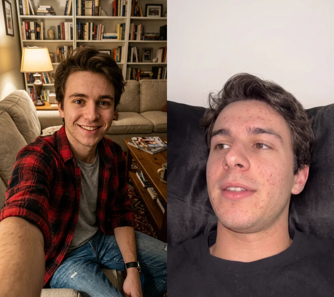
That's the same avatar twice. The left is what the model wants to give you, warm light, posed grin, skin from a moisturizer ad. The right is what we actually post, and the acne is doing more work than anything else in the frame.
The bokeh problem
The single biggest AI tell is the blurred background. Models love bokeh because it reads as professional photography, and professional is exactly the wrong direction. Real phone photos keep the subject and the room in focus, so we say it outright. Both the subject and the background in focus, no blurry background.
It sounds like a small thing. It changes everything. A sharp, slightly boring background full of doors and air vents and light switches is what makes a photo feel like it happened somewhere, instead of being rendered nowhere.
Words are levers
Certain words silently pull an image toward fake, and you have to know your levers. We never write "professional." Never "cinematic." Never "makeup." Each one is a request for the exact polish you're trying to escape, even when you meant it innocently.
The same logic applies to describing people. "Attractive woman, mid-20s, long brown hair, casual style" beats a paragraph of facial micro-detail, because over-describing a face fights the model and produces that over-rendered uncanny look. Describe the person like you'd describe a friend, then stop.
Taste is a library, not a prompt
The move that changed our output more than any prompt tweak was to stop inventing scenes. Real videos already solved lighting, framing and vibe, and they solved it in a way that provably worked, because the video performed. So when we see an aesthetic we want, we grab the video's first frame and file it in a reference library. Bedroom, car, kitchen counter, bathroom mirror.
Then the generation is a swap. Replace the person in the reference with our person, and keep everything else the same, especially the camera angle. That clause about the angle is load-bearing. The angle is where the candid feeling lives, and it's the thing you'd never think to specify from scratch. Borrow it from reality and your person inherits the realism for free.
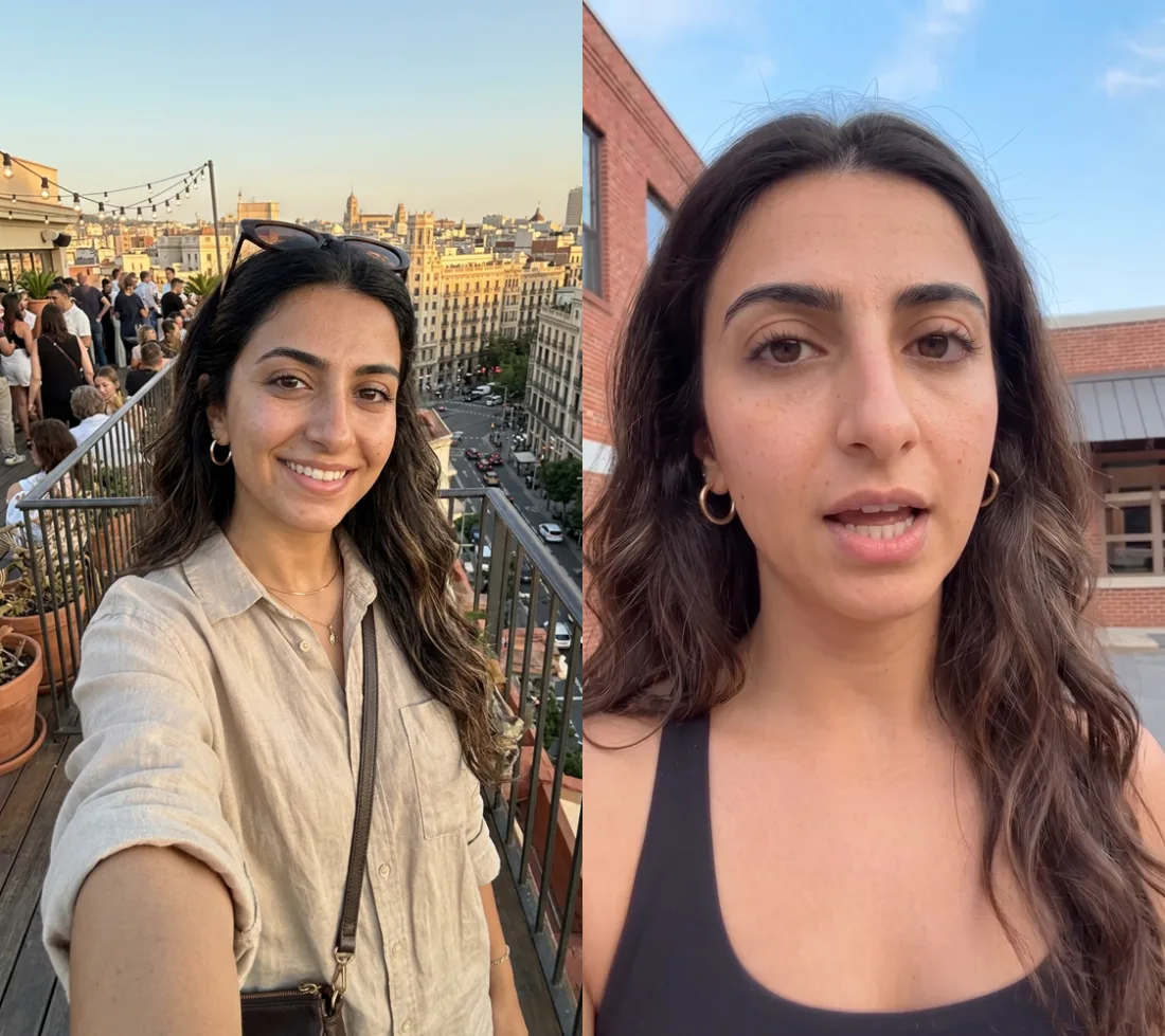
The left image is invented, a golden-hour rooftop party, and it's beautiful, which is the problem. It reads as an ad. The right is built from a real frame. Harsh flat daylight, mid-sentence, a brick building doing nothing interesting. Nobody stages the right image, and that's exactly why it works.
A camera roll, not a render
One image per scene isn't enough, because a real person's camera roll has the same scene from six slightly different moments. So each scene gets variations under a strict rule. Same face, same hair, same outfit, same background, same lighting. Change only the pose and the camera framing. Phone held a little lower so the camera looks up at them. Head tilted, shoulders off-center.
Small stuff, deliberately. It's exactly the small stuff that makes a set of images read as one continuous stretch of someone's actual day instead of nine renders of the same prompt.
Kill the sheen
One tell survives every prompt trick, and it might be the biggest. AI-generated imagery has a glossy, colorful, softly glowing finish. We call it the sheen. Colors are a little too vivid, highlights a little too bright, everything lit like a commercial. You notice it before you can name it, and it's baked into how the models render, so prompting only gets you partway. The rest has to be corrected after the fact.
The left image is the sheen in full effect. Saturated colors, glowing skin, a smile out of a catalog. You could not caption it as anything but AI. The right is the same avatar after the pipeline. Same person, different finish, and the finish is the whole difference.
So we fix it at the end instead. Every video we render gets a fixed color correction applied automatically, as a layer nobody has to remember to turn on. Internally it's literally called the Pamba grade, and every number in it pushes the same direction, less gloss. Saturation comes down about 6 percent, and the candy colors go first. Contrast goes up about 12 percent. Pure black gets lifted slightly, because real phone footage never has true black. And the brightest highlights get pulled down hard, from 100 percent to about 94, because the glow lives at the top of the range. Then a slight cool shift, since the AI sheen skews warm, and finally the result is matched to a CapCut-style finish, because CapCut's look is what real creator footage actually looks like on the feed. We even overshoot the correction slightly, running it at 110 percent strength.
That grade removes production value instead of adding it. Every filter you've ever applied made an image more vivid, more glowy, more done. This one runs the opposite way, and it's the single biggest reason our output doesn't read as AI at a glance.
Volume, then a human
The last part isn't a prompt at all. We generate ten times what we need, every person crossed with every scene, multiple attempts each, and a human picks the keepers. Most outputs die. That's the point. Knowing which image would survive in a real camera roll is still a human skill, and curation is where the final quality comes from.
And once an image is chosen, that's it. No upscaler, no beauty pass, no vivid filter. A crop, and the de-glossing grade above. Every other tool you'd normally reach for after generation adds polish, and polish is the thing we've been deleting this whole time.
We've automated the generation, the reference swapping, the variations, the grade. The picking, we haven't. But the lesson underneath all of it is the same one.
Realism is what's left after you strip everything the model wants to add.